Choosing just the right shade of paint for a room can almost paralyze a person. There are SO MANY CHOICES!
And there are other things to consider besides just colour — like whether or not your space is an open-concept, or if your space is compartmentalized room by time. Ideally, there would be a cohesive scheme one way or another, where colour choices, though entirely different from one another, still seem to go together as one wanders from room to room… but really, it’s your space – choose the colours you enjoy the most!
You might see the perfect shade of paint in a magazine, but buyer be ware – though there are APPs for capturing and matching paint hues you admire, the one you love in particular might not render the same way inside your house. Natural light, halogens bulbs, and ambient lighting can drastically change the look of a paint colour. One minute you think you’ve selected the perfect shade of taupe, but once the lights go on, you’re looking something more akin to… peanut butter. (Some light bulbs cast a red tone, like whoa.) This may not be a bad thing, but if it’s not what you wanted, every time you walk into that room, you’ll slump your shoulders, and groan with dismay, like Olympia Dukakis in Moonstruck. You might even cry a little. (Don’t ask me how I know.)
Choosing just the right shade of paint for a room can almost paralyze a person. There are so many choices!
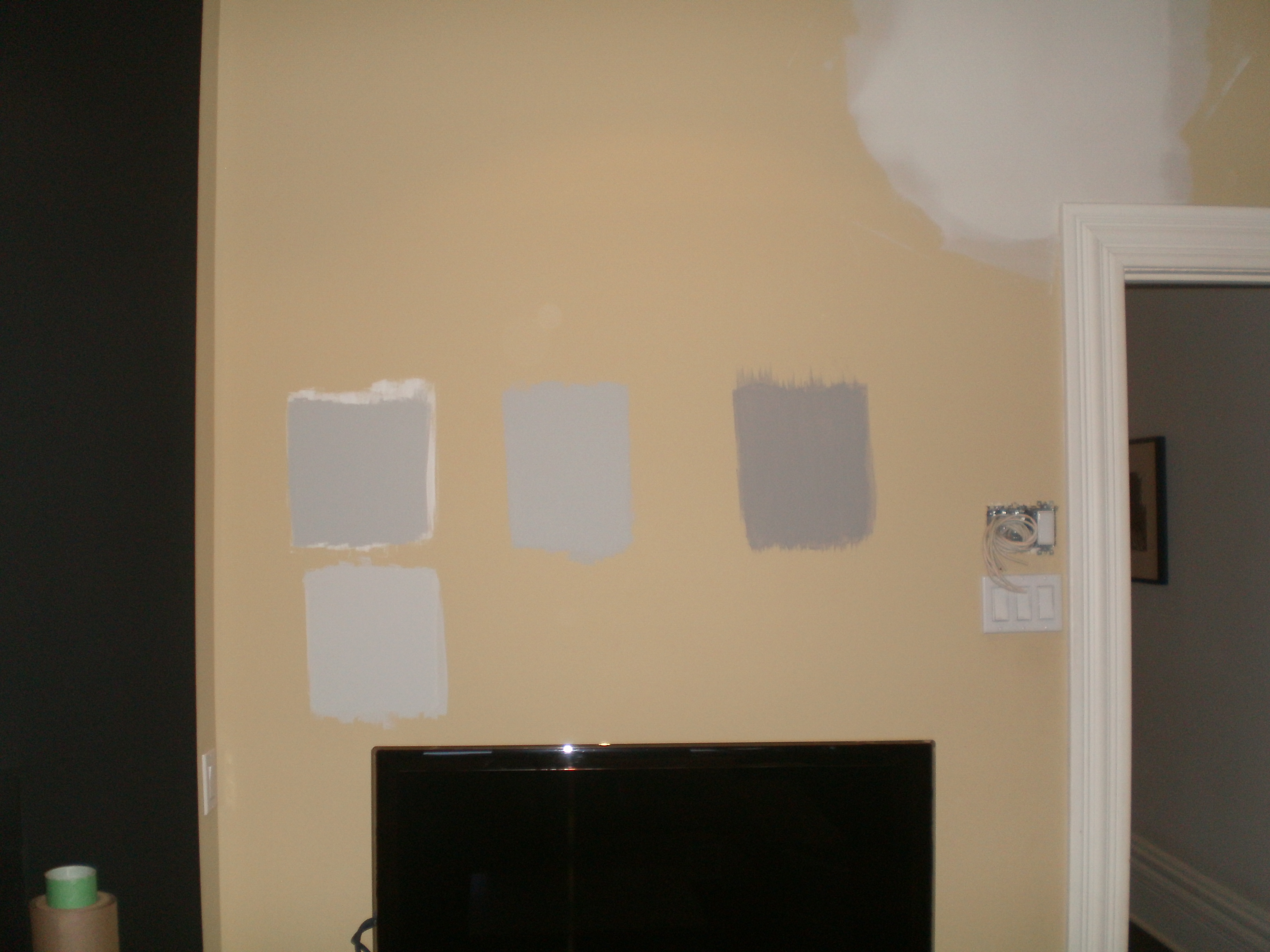
Our kitchen is about to get a fresh coat of paint, and we’ve been deliberating as to a tone of grey. (There are well over 50 shades, as you may know.) It’s a big room, with three windows in it, and a lot of white cabinetry and furnishings, so I’m leaning towards dark and dramatic. Much like myself, I guess. *snort* I find the selection process daunting though – I hate making mistakes. And I hate feeling like I wasted my time and money even more.
The cure for this? Acquire paint samples. Generally, these small pots of pigment can be purchased for under ten dollars each, and though it might seem like an extra expense, if you’re uncertain about your colour, this could save you an even bigger, and more costly mistake.
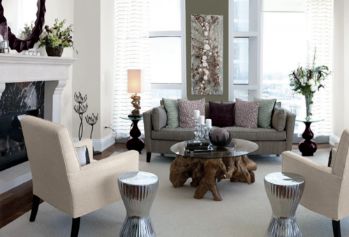
Wall colour: Lunch At Tiffany’s, by Para Paints
The quickest way to find out you don’t want *that* blue in your bedroom is to paint a few samples on the wall. Give yourself a few days to look at the tones in all the light sources that hit it – during the morning light, see how it changes in the afternoon, and again in the evening, with bedside lamps and overhead lights both on and off. Sometimes the colour on the chip is just too intense for a space so large (or so small!) and your pale shade of blue might read as near-white in the evening. Try your colours on for size first.

As per Jen’s recent renovation, she opted for a colour by Para Paints called Lunch At Tiffany’s, which is a warm neutral for her open-concept space. I’ll bet in person it reads an cooler during the daylight, and warm and inviting during the evening, which can be ideal for both optimizing a grand space in a really seamless way, and for making family and friends feel cozy at the same time. That colour is tres chic and modern, too. Gorgeous, gorgeous…
If it’s not what you wanted, you’ll slump your shoulders and groan with dismay, like Olympia Dukakis in Moonstruck.
For what it’s worth, I always painted my sample colours in swatches right beside trim in two or more areas of the room. It gave a truer reading than paint squares in next to each other in the middle of a painted wall. I found the old wall paint was throwing off my perception of the colours so I also tape a white sheet on the other side of the new paint so the old paint would not reflect on the colour. It was tedious but I HATE repainting so worth it to get the best impression. Love GREY!
I know – we had samples on a few different walls in the kitchen, and we used primer beneath some swatches as well… taped white paper up… all of it. And in the end? My colour is still a little bluer than I wanted, but it’s not horrible.
I am LOVING my Para “Lunch at Tiffany’s”! Paint selection was one of the most nerve wracking but we got it right. Phew!
I’m so glad you love your colour, Jen!
ugh, I know about that WRONG colour – I painted some stairs a deep red once that was meant to be more burgundy, and instead looked like a bloodbath. Yes, I repainted. *shudder* And the room in our old house that someone before us had painted baby poo brown. *barf*
I love colour, though, so my house looks a bit like an easter egg, each room a different colour, and I once painted a bright, BRIGHT yellow in our old place that a couple of people warned me would be too much, but it wasn’t in the dark, cave-like room it was in, it was exactly what I wanted. Light really is everything, so even if you just bring the paint chips home an d look at them in your to-be-painted room, it can make a huge difference.
Oh, woman… Bloodbath? Baby poo brown?! How dreadful!!
And you’re right – lighting really is everything. And spending some time with your choices is never a bad thing, I reckon.
We just chose a few paint colours as we are prepping our house for sale and you are so right.
We wanted neutrals but when I got them home I hated them. I took my paint right back to my paint professional (who had advised us our neutrals were too pale) and she was able to bump us up two tones and now I am much happier. The rooms feels warmer and more inviting!
Sooo great, Jackie!!