It’s been 13 years since we’ve moved into our house. Things are starting to look “well loved” and a tad dated. I’m eyeing the kitchen is the next big project. Jen Maier and I were discussing home renovations recently. I know she’s been scoping out Pinterest and getting ideas for a while but we both agree it’s overwhelming at times.
I always start by collecting inspiring visual images to get a sense of direction. There are so many amazing inspiring sources – Houzz, Living Etc. and Pinterest, plus a myriad of design mags and books. Collect a folder of images and pretty soon you start to see a pattern or consistency in your choices. Put notes on the images to remind you what you liked about it. ie. the backsplash tile, the cabinet colour/style etc.
It’s also important to think about the overall aesthetics of the kitchen space and how that vision will work within your home. Today, many homes have open concept layouts. All of the adjacent spaces should relate to each other from a style, colour and material perspective. Think about what style and colours you relate to, and use this as a guide.
Another great exercise is to start playing with layout and design using the IKEA online planner. It’s a very easy tool to use, allowing you to visualize 3 dimensionally your new kitchen space. You can also easily change the cabinet style and colour with the click of a few buttons.
Great question, because typically a kitchen renovation is one most people save up for and don’t undertake very often. Choosing a timeless door style will allow you to update it occasionally with new accessories, lighting and accent colours. While it’s important to keep your kitchen current, it doesn’t need to follow every trend that comes along.
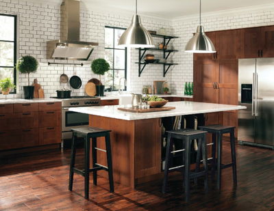
I like to use a Shaker style door, such as ÄDEL – it’s transitional and can be used in many different styles of homes. It also has a chameleon-like quality that allows it to take on both a modern or traditional look depending on what it is paired with. For example, in this image I used ÄDEL medium brown with open shelves and classic white subway tile. The combination of classic materials and finishes helps to create a traditional bistro style kitchen.
My number 1 mantra for preventing counter clutter is “A place for everything and everything in its place!” I know this is easier to say than to do, but if everything has a designated home, then it is more likely to be put away. Here are a few examples to help with clutter management:
in place.
1. Changing the knobs on your kitchen cabinetry can give an instant lift and provide the finishing touch.
2. Upgrade your lighting. Create a new focal point by replacing an existing pendant lamp with a dynamic, show stopping fixture. Or revisit bulb wattage to ensure optimal
lighting levels.
3. Paint is your best friend. Refreshing a room with paint not only maintains a space, it offers an opportunity to inject an “of the moment” colour.
4. If some of your cabinet doors are looking a bit tired, selectively remove some of the uppers. Wallpaper or paint the back of the cabinet to create a whimsical unfitted kitchen look.
5. Line all of your drawers and shelves with RATIONELL drawer liners. The non-slip surface is easy to clean and helps keep items in their place.
6. Fresh cut flowers or potted herbs always brighten a kitchen space.
7. Add under counter work lighting to provide an even, glare-free light.
8. Splurge on a marble tile back- splash. A small area can be less expensive than you think if you do the labour yourself.
Are you thinking about doing a Kitchen Renovation this year, too? Any other tips and advice for us?
For more kitchen reno ideas, big or small, visit www.ikea.com
This post is not sponsored nor was I compensated. The kitchen reno on my mind and maybe yours too.


Leave a Reply