The kitchen backsplash was turning out to be the toughest decision yet.
I have come to realize that the kitchen is the most complex and time consuming room in the house to redesign. There are so many details and decisions to make it is mind boggling. And one of those decisions has had me virtually paralyzed: The Backsplash.
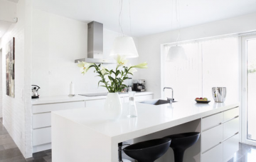
Months ago I had selected our IKEA Abstrakt high gloss white cabinets and our beautiful Whirlpool White Ice appliances. The palate was simple – white – so how hard could selecting a backsplash really be? You have no idea the torture I have put myself through!
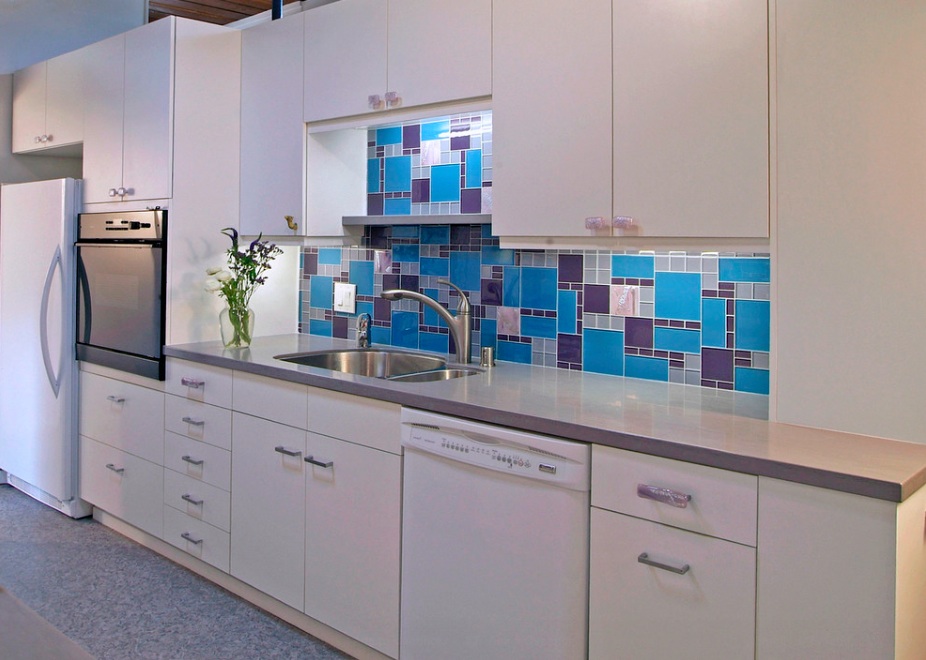
A backsplash can be a feature or it can add consistency to your existing design.
I consulted designers who said in a smaller kitchen (which despite being totally redone and enlarged, ours apparently still is) white makes things appear larger. So I was on the right track.
However, the advice on backsplashes was both conflicting and confusing. Some experts said a backsplash could be used as a way to add detail and colour to a singular palate or introduce interesting materials such as stainless steel or glass. Others said by adding colour or contour one would make the space seem divided. And others still indicated that a backsplash is unnecessary and one could just continue the countertop up the walls or use a durable paint.
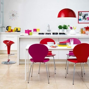
Add colour to a white kitchen using colourful accessories.
I knew I wanted a tile backsplash as my cooking left something to be desired and the durability and ease of cleaning was appealing. I also knew that I wanted to maintain the simple and clean design of the rest of the house so staying in line with the white cupboards for the backsplash made the most sense.
Plus, I believed the advice of designer Silvia Mazzone form edesignboutique.com when she told me that the best way to add colour or contour in most rooms is through accessories. In other words, use items you can easily change. This will give you flexibility and ensure that your design stays relevant longer.
Sometimes all it takes is a deadline to help you make decisions.
OK. Easy-peasy, right? No way! I was blown away by how many options there were for my white backsplash. From variations in colour to size to shape, design and material, this decision just kept getting more and more difficult. But it really only took one simple thing to help me make a decision: A deadline. That made it very easy.
I simply had to decide so I went back to the main principles and budget and ended up with something I am very happy with. The size is interesting at 4″x16″, the colour is white with a hint of steely grey that works with the stainless steel accents of the Whirlpool White Ice appliances and there is a hint of texture to it.
What do you think?
This post is sponsored by Whirlpool Canada.


Are you happy with the white on white of the IKEA white Abstrakt with the White Ice of Whirlpool? Do they match well enough?
I love it! With the stainless steel accents and the counter top and backsplash having a little “texture” it looks very sleek.
love it and the accessory thing makes sense but whoa I got excited when I saw that blue…love that too!
Love it! Next question is how to lay the tile…typical subway offset or all lined up in rows? Maybe 90-degree herringbone? Whatever you pick, it’s going to look gorgeous.
Also totally agree about adding colour with accessories – if you tire of red (or it goes out of style) you can easily switch over to blue or gray or green or whatever the couleur du jour without having to retile your whole backsplash!
Love the texture of this backsplash! It gives the whole white theme a little depth without having to commit to a colour that you may get tired of later. Nice! We’ve been researching (sort of but not fully committed yet) to a new backsplash ourselves. So, this is giving me incentive!
Looks good, Jen! I love the dimensions – very modern. White grout?
I’m a fan of subway tiles – classic, a hint of retro, but not boring, and the fine striping adds a little modern touch. I’m a huge fan of colours myself, so when I do my kitchen some day, I’m thinking a subway tile with a little stripe of colour is one of my favourite options, thouh I do love glass mosaic tile, too… Good thing I have a few years!
That is what made it so tough, Alice! SO many beautiful options. Some of the tiles were like works of art. Btw, we have been planning this for 13 years. Dreams do come true!
I like it! I am picking tile on Thursday for my all-white kitchen. Wish me luck!
Good luck, Aileen. You’re going to need it! 😉